

7The look of your store
Make your store yours: theme, colours, fonts, your home page and other pages, menus, the header and footer, and the words shoppers see.
Choosing a theme #
Online store → Theme
Start with one of the five starter themes: Metro, Fynbos, Karoo, Coastal or Harbour. Each sets your colours, fonts, button shape and header style in one go. Press Use under the one you like (for example Use Karoo); your products, pages and menus stay as they are.
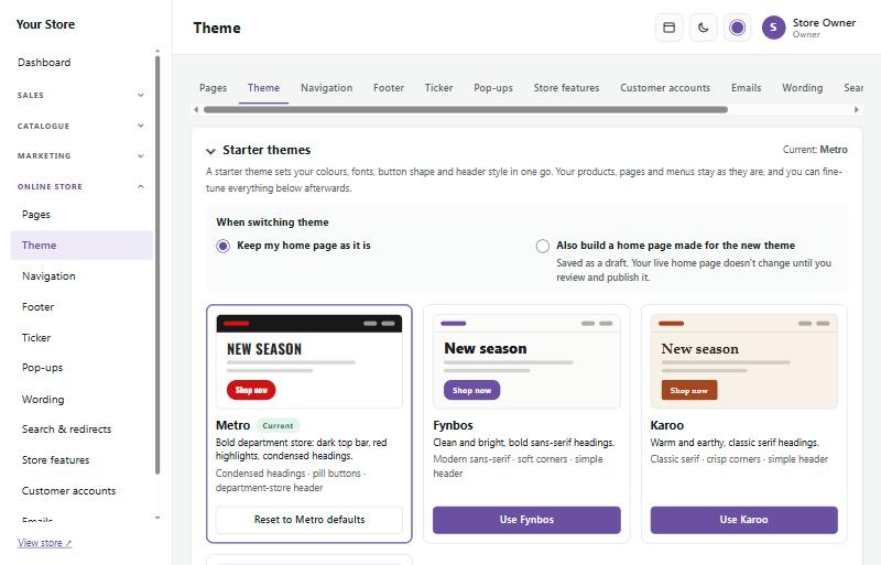
Then fine-tune it further down the page:
- Colours: brand colour (buttons and highlights), second accent, text and background. The page tells you if text would be hard to read.
- Text on coloured buttons and labels: automatic (white or black, whichever reads best), white, black or a colour you choose. This also changes labels like ALL DEPARTMENTS and the search button.
- Fonts: choose from the list or any Google font by name.
- Heading weight: bold (the usual), semi-bold, or light and elegant, which suits serif fonts.
- Buttons: solid, outline or pill, and how rounded corners are.
- Header layout: department store (big search and an All departments menu) or simple (logo, menu and cart in one row).
- Logo size and Logo size on phones: how tall your logo is on computers, and on phones and small tablets. On phones it is Automatic (the computer size, up to 52 pixels) unless you choose My own size. A bigger phone logo needs room in the phone header: move icons such as the light/dark switch or search into the menu under Edit header → Header on phones. A logo too wide for the space shrinks to fit, so it never covers the icons.
- Page width: standard, wide, extra wide, full width or a custom width.
- Product page: picture size, where the extra pictures go, and where the product tabs sit.
- Picture zoom: what happens when shoppers point at the main product picture with a mouse: nothing, zoom inside the picture, a magnifying glass, or a zoom window beside the picture (as big electronics shops do). Choose how far it zooms in (2× to 4×). Zoom looks sharpest with pictures at least 1200px wide.
- Full-screen viewer: tick it and a click or tap on a product picture opens all its pictures full screen, with arrows, swiping, thumbnails, and a click, pinch or scroll to zoom in. On phones and tablets this is how shoppers look closer.
- Picture sizes: how big the small extra pictures on product pages are, and the product pictures in the cart and checkout.
The preview on the right follows your changes. Press Save theme to apply them to your store.
When you press Use on a starter theme you can also choose Also use the new theme's home page layout. It is saved as a draft with the pictures you added kept, and nothing changes on your store until you publish it.
Home page layouts
Each starter theme has its own home page layout. Under Online store → Theme → Home page layouts you can use any of them, whatever theme your store has: for example Harbour's Showcase slider with Karoo's colours and fonts.
- Press Use this layout. The layout is saved as a draft of your home page, so nothing changes on your store until you publish it in the page builder.
- The pictures you already added move into the new layout: slides, Promo Blocks, Middle Banners, banners and the story picture.
- Tick Put placeholder pictures in the empty spots to show where your own pictures go. Spots that already hold a picture are never changed. Replace the placeholders with your own pictures in the page builder, or remove them all at once with Catalogue → Products → Sample content.
The Demo library #
Every SaleCart comes with the live SaleCart demo designs: see a demo, use a demo. Open Online store → Demo library to browse them. Each card has See it live (the demo store opens in a new tab) and Use parts of it.
- Switch to this demo changes your whole design in one step: the look (theme, colours, fonts, corners and buttons), the header and footer layout, the product page layout and your home page with its slides and banners. A screen first lists what changes and what stays. Your products, categories, pages, orders, customers, logo and other settings are never touched.
- Tick Also add the sample products to get the demo's products with photos, brands and categories (off to start with). If you have sample products from an earlier demo that you never changed, you can remove them in the same step.
- Saved designs: before every change your design is saved. Switch back returns to the last one, and Restore to an older one, exactly as it was. The last 8 are kept.
- Only its look changes colours, fonts, corners, buttons and the search bar, and leaves your home page and words alone.
- Its home page puts the demo's whole home page in place of yours, as a draft to review or published straight away.
- Add one section: choose any section (hero slider, Promo Blocks, Middle Banners, brand logos, product rows, trust blocks, image with text…) and where it goes. It goes into your home page's draft.
- Backgrounds and banner pictures: tick pictures and press Copy the ticked pictures. Then use them on any picture field with Choose from server.
The top of the page shows which demo your design comes from, or Custom (based on …) once you've mixed in parts of other demos. Pictures are copied once and named after what they show, and links to categories your store doesn't have go to all your products instead.
The page builder #
Online store → Pages lists your home page and your other pages (About us, Delivery, Terms…). Click a page to open it in the page builder.
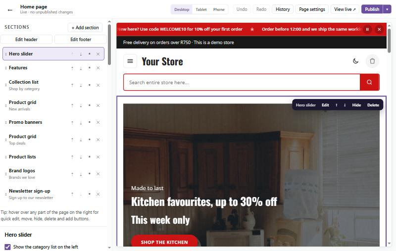
- The Sections list on the left shows the blocks your page is made of, from top to bottom. Click one to edit it.
- + Add section adds a new block: hero slider, product grids and sliders, category tiles, Middle Banners, text, pictures with text, videos, reviews, Google reviews, FAQs, brand logos, a newsletter sign-up, your own HTML and more. Choose From a demo at the top of the list to add a ready-made section from one of the demo designs.
- Use the arrows to move sections up and down, the eye to hide one for now, and × to remove it.
- On the right is a live preview. Hover over any part of it for quick buttons to edit, move, hide or delete.
- Desktop, Tablet and Phone show how the page looks on each screen.
- Undo and Redo step back and forward through your changes.
Your changes are saved as a draft while you work. Nothing changes on your store until you press Publish. Use the arrow next to Publish to schedule the change for a date and time instead, or to discard your draft. History brings back any earlier version.
Tip: work in one page builder tab at a time. If you leave an older tab open and publish from it, it puts back what that tab still shows.
Editing a section
Sections with several parts open on tabs. The hero slider, for example, has Slides, Style, Promo Blocks and Settings. Middle Banners have Banners and Settings.
Slides, banners and logos are listed one per row with a small picture:
- Click a row to open it (one at a time).
- The green switch shows or hides it on your store without deleting it. A hidden one stays in the list, struck through, so you can switch it back on later.
- Drag a row by its ⋮⋮ handle to change the order, or use the ↑ ↓ buttons.
- × removes it; Undo brings it back.
- + Add slide (or banner, or logo) adds a new one, starting with the look of the one above it.
An open slide or banner has its own small tabs: Content (the words, button and picture), Picture (Middle Banners only), Background and Style.
Spacing (on a section's Settings tab) can be normal, compact, roomy, No gap above (so a banner sits right under the menu bar) or No gap above or below. Choose Width → Full width for edge-to-edge banners.
Editing on the page
You can also change your banners right on the page in the preview, without looking for the field in the side panel.
- Click a heading, small line, price line, button or picture to select it. A small dark toolbar shows above it, and the side panel opens at the same field.
- Click the words again (or double-click them) to type straight into them. Press Enter to keep the new words, or Esc to put the old ones back. Rich text (with bold, lists and links) opens in a small box instead.
- Click a slide, Promo Block, banner or card around its words to select the whole thing. Its toolbar moves it ← →, Duplicates it, Hides it (it stays in the preview, dimmed, so you can show it again) or Deletes it. Content, Picture, Background and Style open its settings in a small box, and Sale sets a slide's products, prices and countdown.
- Pictures: Upload a new one, choose one already on the server, Remove background (with Photoroom, once you set it up under Catalogue → Images → Background removal; your original picture is kept), Focus (the part of a photo that stays in view) or Remove.
- Backdrop, Countdown and Products open their own choices. Prices come from your products, so change them under Catalogue → Products.
- Your own HTML banners are changed only through their code (Edit code).
- Empty spaces show + Add … while their banner is selected: click one to fill it.
The banner library. Replace swaps a slide, Promo Block or Middle Banner for one from any demo (or from your own library), and Add puts one after it. Slides, Promo Blocks and Middle Banners can stand in for each other. From a demo on a picture takes just its picture. Tick Use my brand colours to fit it to your store. Point at an item to see it live first. A demo's photos are copied into your store only when you use one.
Save keeps a banner or section in My library, to use again on any page. Send puts a copy on another page's draft.
Everything works with the keyboard: press Tab to reach a part of the page, Enter to select it and type, F2 to go to its toolbar (the arrow keys move along it), and Esc to step back. Undo and Redo work for every change, and nothing goes live until you Publish.
Moving parts into place
Every part of a slide, Promo Block or Middle Banner can be dragged to exactly where you want it in the preview: the small line, heading, price line, key features, prices, countdown, button, picture or video, and the saving sticker. Hold Shift while you drag to move the whole block of words at once.
- Each kind of screen on its own. A move counts for the screen the preview is showing: computers, tablets or phones (use the screen buttons above the preview). The toolbar says which one, for example Drag to move · phones. Move a heading on phones and it stays where it was on computers.
- Snapping. A part snaps to the middle of its banner, across and up and down (a pink line shows), and back to its own place. Hold Alt while dragging to place it freely. A part can't be dragged out of its banner.
- Fine moves. With a part selected, the arrow keys move it one pixel at a time, or ten with Shift.
- Reset puts the selected part back in its own place on this kind of screen, All screens uses its place on computers, tablets and phones too, and Words box puts the whole block of words back.
- A part is moved from the place the banner's layout gives it, by a share of the banner's width, so it holds on every size of that kind of screen, and words still wrap and push each other apart. Undo and Redo work for every move.
Banners made before version 1.20.0 keep their look: the old sliders for moving the words and the button, the Promo Blocks' text height and label position, and the Middle Banners' picture side and height are no longer in the settings, and dragging takes their place.
Hero slider
The hero slider shows large rotating banners at the top of your home page.
- Content: a small line above, a heading, a price line, a button and a picture or YouTube video.
- Background: a colour (or your own colour), a colour gradient with its direction, a photo, or your own HTML and CSS. There are two photo backgrounds:
- Photo: the photo exactly as it is.
- Photo with shade: a shade over the photo so the words stand out. Shade strength sets how dark it is, Shade where it comes from (from the left, from the right, top, bottom or even all over), and Shade colour whether it's black or a colour. Choose Black (as before), White, Brand colour, Dark navy and more, or Your own colour and pick any colour under Your shade colour. With White, or a light colour of your own at 40% or stronger, the words turn dark by themselves. The big hero banner has the same choice under its own Shade colour.
- The shade only covers the background photo. Product pictures always sit on top, clear: over a photo they show cut out when they have a Photoroom cut-out or are see-through PNGs, otherwise as they are.
- Text colours picks light or dark text to suit the photo.
- Photo focus: which part stays in view when the banner crops it. Choose Top to keep people's heads in the picture.
- Style: set for each slide on its own:
- Text position: left, right or centred.
- Buttons: six styles (solid, solid with an arrow, white, outline, frosted glass or a text link), the shape and an effect (lift, shine or pulse).
- Small line above the heading: the label's look and an optional animation.
- Text entrance: how the text comes in (rises, fades, slides or zooms).
- Heading effect: makes the heading stand out on a busy photo: a soft or strong shadow, a glow in your brand colour, an outline round the letters, a see-through dark band or a brand-colour highlighter behind the words, a 3D stacked shadow, or gradient letters. Promo Blocks and Middle Banners have it too, under More settings.
- Price line: a sticker, a flat label or plain text.
- Accent line: a line above or under the heading in seven styles, with its length, colour, alignment and animation.
- Colour glow: a brand-colour glow over a photo from any side, at three strengths.
The slider's Style tab holds what belongs to the whole slider: the Look (Classic or Showcase), Corners, Slider height (standard up to nearly the whole screen, for bigger banners) and the corner light. On Settings, Slide order on each visit shows the slides in your order, starting on a random slide, or shuffled for every visitor.
Sale slides: on a slide's Content tab, pick up to four Products to promote. Their pictures are shown big: cut out when a picture has a Photoroom cut-out (see Catalogue → Images → Background removal) or is a see-through PNG, otherwise on a neat white card. For a picture of your own, tick Show the product cut out. Tick Show the price for the was and now prices and the saving, type up to four Key features (shown with ticks), and add a Countdown to the end of the products' sale or to a date and time you choose. Hide this slide when the countdown has ended takes the slide off by itself. On the Background tab, a Sale backdrop draws a spotlight, brand-colour rings, a light studio, a neon grid, speed stripes, an angled panel or a sky-to-sea horizon behind the products.
Tick Don't show the products' pictures when the slide's own photo already shows the product (for example, a model wearing the frames): the slide then shows only the price, the key features and the countdown, and the saving sticker sits beside the heading.
The round saving sticker shows "Up to 15% off" (or "Save 15%" for one product) by itself. To use your own words, click a line on the sticker in the page builder and type, for example "Gold" and "SALE". Each line can also be changed on the slide's Content tab. Leave a line empty to go back to the automatic words.
Backdrop library: the Sale backdrop is chosen from a library of tiles, each a small moving preview in your own brand colours, marked Light, Medium or Dark and sorted from light to dark. Click a tile (or use the arrow keys) to choose it; the preview shows the slide straight away. New in 1.12.0: Pastel (light, with soft drifting brand-colour clouds), Glass (a mid-tone brand colour with frosted glass panels and a slow light sweep) and Aurora (a night sky with flowing aurora ribbons and stars). New in 1.15.0: Bubbles (light, with glassy brand-colour bubbles drifting upwards), Sketch (light paper with a fine grid and slowly turning drawing rings), Waves (a mid-tone brand colour with soft rolling waves), Mesh (a mid-tone brand colour with slowly shifting colour blobs), Ember (near-black with rising embers and a warm glow) and Rays (dark, with soft light beams from above and drifting dust).
Picture size on computers, Picture size on tablets and Picture size on phones set each slide's picture size separately, from small to extra large, or Fill. On phones a large picture can go above or below the words. Pause while the mouse is over the slider (on Settings) is on to start with: untick it to keep the slides moving.
On phones the slide changes only when the shopper swipes clearly sideways, so scrolling down the page never changes it by accident.
Pictures you upload can be up to 2 MB. Bigger pictures are shrunk automatically before they are sent. For very large pictures, put them in the images folder on your server (with FTP or File Manager) and press Choose from server….
Promo Blocks
The hero slider can have three small Promo Blocks, beside the slider or in a row under it. They have their own row in the section list, Promo Blocks, just under Hero slider. Its switch turns all of them on or off.
Click Promo Blocks to edit them:
- Where the promo blocks go: beside the slider, or under it.
- Width of the promo blocks (when they are beside the slider): narrow, standard, wide, extra wide, or growing with the screen. On tablets and phones they always move under the slider.
- Each block has its own on/off switch. Drag ⋮⋮ (or use the arrows) to change the order; everything about a block moves with it.
- Click a block to edit it. You only see the basics: a row of Background swatches (your brand colour, charcoal, light grey, sunshine, four ready-made gradients, Photo, which shows a photo upload and a shade slider, or the rainbow swatch, which opens a colour picker for your own colour), then the title, the small line above it, the link and the picture.
- More settings opens everything else: the button text, picture size and style, your own colours, gradient direction, photo focus, a border, and the same text, button and label styles as a slide.
- Picture frame puts the picture on a frosted glass panel, so a dark product stands out on a dark block; Automatic for dark pictures does that only when a dark picture sits on a dark block.
- Picture size is set for computers, with its own choice for tablets and for phones (small to extra large; on phones, Large and Extra large make the block taller). With Large or Extra large, the empty margin around the product is trimmed off by itself, so the product fills the space.
- In the page preview, point at the Promo Blocks and press Edit to jump straight to them.
Gradients can come from the block's colour, go from your brand colour to your second accent, or use a ready-made pair (Sunset, Ocean, Berry, Mint, Midnight, Peach, Sky, Gold, Forest or Steel).
Middle Banners
The Middle Banners section shows two to four banners side by side, further down the page. Each has the same Content, Background and Style choices as the Promo Blocks, plus a Picture tab:
- Layout: in the corner beside the text, half and half, the picture on top, or large and faded behind the text.
- Size of the picture. Drag the picture to where you want it (see Moving parts into place).
- Shape: as it is, rounded corners, a circle, on a white card or with a soft shadow, and whether it shows whole or fills the space.
- Effect: grows, tilts, floats or slides in.
- White background of the picture: blend it into light banners, keep it white, or remove it: the picture's Photoroom cut-out is used (or the picture itself when it is a see-through PNG), so it sits cleanly on any colour. A picture without a cut-out is blended in instead. (SaleCart's own white-background removal was removed in version 1.16.0: its edges were rough.)
On narrow screens, a picture in the corner moves under the text so the words keep their room.
On the Picture tab, Size on tablets and Size on phones can differ from the size on computers. Corners (on the section's Settings tab) makes all the banners square, slightly rounded, rounded or extra round.
Hero banner
The Hero banner section is one large banner with up to three smaller banners, in a row below it or stacked on the right. When they are on the right, Width of the smaller banners sets how much room they take: a quarter, a third (standard), two fifths, or half and half.
Image with text
The Image with text section puts a picture beside a short story, with a heading, an optional small line above it and a button. Choose which side the picture goes, and a Look: Standard, or Elegant, with more space, fine lines, the picture in a thin frame and a quiet text-link button (lovely for jewellery, beauty or wine).
Set Text type to Your own HTML to write the text column in HTML instead. Inline styles such as `style="color:#c00"` work in this and every other HTML box (HTML banners, hero slides, the Text section's side column and the footer); scripts are always removed. With your own HTML there is also a CSS box that only styles this section. HTML banners, Image with text, the Text section and HTML hero slides also have Heading colour and Text colour (leave them on Automatic for the theme's colours).
Category promo cards
The Category promo cards section shows big cards for your categories, two to four side by side (two on tablets, one on phones). Each card has a square banner, three product pictures beside it, the category's name, how many items it has and a Shop button. The whole card links to the category.
- On the Cards tab, choose the category of each card (up to 8). Left empty, a card shows your next main category. Items in its sub-categories count too.
- Each card has four small tabs: Content, Picture, Background and Heading. What you set there is only for that card.
- Picture → Banner: Made for you (the standard) draws the banner from a background, a heading and a picture, and makes it again by itself when you change any of them, your brand colour or the photo. My own full banner picture uses a square picture you upload as the whole banner, with no background or heading added. Cards that already had an uploaded banner keep it that way.
- Picture in the banner: the category's best product photo, A picture I choose (upload one or Choose from server; a product on a white background works best) or A product I choose. Picture background: Automatic uses the photo's cut-out (its Photoroom cut-out, or the photo itself when it is a see-through PNG) and a white rounded card when there is none or it would lose parts of the product; White rounded card always uses the card; No white card uses the cut-out with a soft shadow, or the plain photo with a shadow when there is no cut-out.
- Background: Same as the section follows the section's Made banners setting. Or give the card its own style: rich gradient with rings, light tint, solid colour, two-colour gradient, soft glow, diagonal lines, dots, fine grid or waves, in your own Colour (empty: your brand colour) and Second colour, and for gradients and patterns the direction. The round swatches pick your brand, accent or text colour, white or black.
- Heading: show or hide it, write your own words (empty: the title under the banner), choose the Heading colour (automatic, white or dark) and add Small words above or under it: how many items, "Shop now" or your own words.
- Title on the Content tab changes the name under the banner, and Button label the button's text.
- Product pictures: the newest, the bestsellers or the specials in that category, or up to three products you choose. Products without a picture are skipped.
- On the Settings tab: the heading, the link beside it (Browse all products by default), how many cards go across, and whether to show the product pictures and the number of items.
- When a shopper points at a card it lifts, the banner zooms with a light sweeping across, and the button turns dark. Choose No effect to keep it still. Shoppers who asked their device for less motion never see the movement.
The number of items and the product pictures update by themselves as you add or sell products.
Brand logos
The Brand logos section shows a moving strip or a grid of logos. Choose how many show across (2 to 8) and the logo size, up to 240 pixels high. Each logo can also be made larger, extra large or huge on its own.
Text with a side column
The Text section shows a heading and paragraphs across the full width of the page. Choose a side column to place pictures, YouTube videos, extra text, buttons, your contact details or your own HTML beside the text, on the left or right.
Map
The Map section shows a Google map of your store address (from Store setup) or any other address, place name or GPS position, with your contact details, opening hours and a Get directions button. The Settings tab holds the place and what to show; the Style tab holds the layout, size and look. Choose a Layout:
- Map beside your details: map on the right or the left, and narrow, medium or wide.
- Big map with your details on a card: the map runs edge to edge with your address and hours on a card over it, in one of six positions (left, right or a corner).
- Just the map: narrow, medium or the full page width, lined up left, centre or right, with the heading above.
- Edge-to-edge strip: a map across the whole screen under the heading, ideal above the footer.
Set the Map height with the slider (160 to 900 pixels), or tick Fill most of the screen. Under On phones, choose a bit shorter (recommended), the same height, or short. Then pick the map colours (normal, black and white, or dark, to suit a dark store) and the corners (rounded, extra rounded or square). By default the map only loads when a visitor clicks Show map, so nothing is sent to Google before they ask (good for POPIA); you can have it load straight away instead. On the Style tab you can also hide the Open in Google Maps link under the map.
A small map in the footer is set per footer column: tick Show a small Google map (or Small map under Online store → Footer) and choose your store address or another place. Then pick its size (very small to extra large, or square), full colour, black and white or dark, map or satellite photo, the zoom and the corners, whether to show the Open in Google Maps link under it, and when it loads.
Blog #
Online store → Blog
Write articles for your store's blog, at /blog on your store. Add a link to it in your menu under Online store → Navigation.
- The article is written in a visual editor: headings (three sizes), bold and italics, lists, quotes, divider lines and links. Picture uploads a picture into the article (describe what it shows, and add a caption if you like), YouTube video adds a video, Table a table with a heading row, and Code text shown exactly as typed. Each of these shows as a card in the article that you can Edit or Remove. Plain text version shows the article in its text form.
- Summary, cover picture and categories: shown in the blog list. Categories get their own page each (Categories under Online store → Blog).
- Status: a Draft only staff can preview. Published with a date in the future goes live by itself at that time; until then visitors who open its address are taken to the blog.
- Search engines: each article has its own title and description for search results, is in your sitemap, and gets the article details Google reads. The blog has an RSS feed at /blog/feed.
The blog shows only once there is at least one published article.
Menus #
Online store → Navigation sets the menu shoppers use to get around.
- Each item has a name and an address, like Pantry → /collections/pantry.
- + Add a dropdown item puts items in a dropdown under a menu item.
- Use the arrows to reorder and × to remove.
- Icons: click the + square beside an item to pick an icon from the store's icon library (shopping, delivery, people, home and lifestyle, tech and more). Type in the search box to find one, or choose None. Dropdown items can have icons too.
- Menu icons decides how they show in the header: beside the name, above the name, or icons only (the name shows when someone points at the icon). On phones, icons always show beside the name.
The same icon library is used for Trust blocks and Feature groups in the page builder: click the icon on a block to choose another.
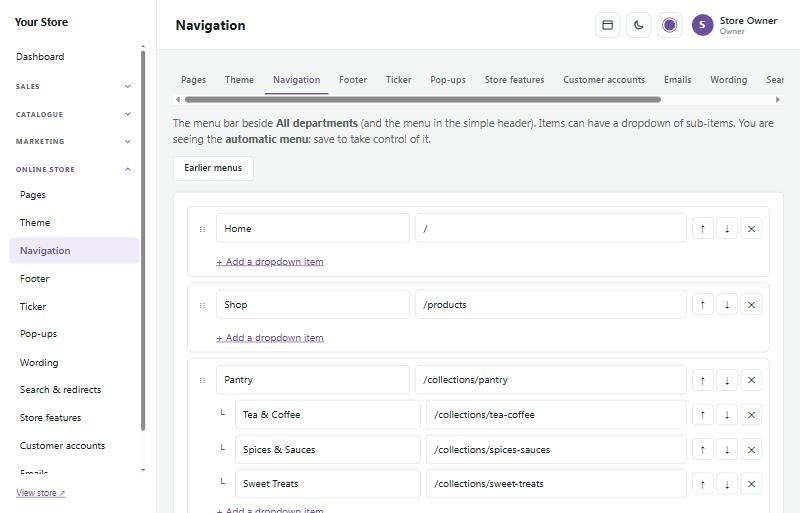
Until you save your own menu, the store makes one automatically from your categories. Earlier menus brings back a menu you replaced.
Your own wording #
Online store → Wording changes any word or phrase shoppers see, everywhere on your store: for example Shipping to Delivery, or Add to cart to Buy now. Leave "To" empty to remove a word. The admin area stays as it is.
Store features #
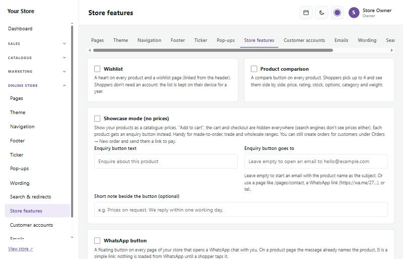
Online store → Store features switches on extras:
- Wishlist: a heart on every product and a wishlist page.
- Product comparison: shoppers compare up to 4 products side by side.
- Showcase mode: hide prices and the cart, and take enquiries instead (handy for made-to-order or trade ranges).
- WhatsApp button: a floating chat button in four styles; on a product page the chat already names the product.
- Cookie notice: a short note that your store uses cookies, from a bar along the bottom to a single quiet line in a corner, in dark, light or your brand colour.
AI chat #
Online store → AI chat adds a chat assistant, powered by AI, to your store and to your admin.
- Chat for shoppers: a chat button on every page. Shoppers ask things like "Do you have this in blue?" or "How much is delivery?" and the assistant answers from your own store: it looks up your products, prices and stock, your payment and delivery options, returns and the pages in your footer, and links to the right page.
- Assistant in the admin: a chat button at the bottom of every admin page. Ask "How were sales this week?", "Which orders still need to be sent?", "What's low on stock?" or "How do I add a discount code?". Each staff member only gets answers about what their role lets them see.
- What it should know: add opening hours, delivery times, sizing advice or anything shoppers often ask.
The assistant can only look things up: it never changes orders, products or settings, and never sees customers' email addresses, phone numbers or addresses.
To switch it on, create an AI key with the AI provider at console.anthropic.com, add some credit there and paste the key in. The provider bills you for each message (with the Fast model, roughly 10 to 30 cents a message). Most shopper messages a day puts a ceiling on that bill. Shoppers' conversations are kept for 30 days and listed on the same page, so you can see what people ask.
Custom CSS and code #
Online store → Custom CSS & code lets you fine-tune the look with your own CSS, and add code from tools such as Google Analytics, Hotjar or a chat service. Both are kept in your store's settings, not in files, so updates never overwrite them and the Code check stays clean.
- Your own CSS: type it in All screens. It is added after the theme's own styles, so where both style the same thing, yours wins. Press Tab to indent (press Esc first to move on with Tab).
- Wide screens and phones: Extra CSS for wide screens (1800px and wider) and Extra CSS for phones (560px and narrower) are wrapped in the right media query for you, so just write the rules.
- Fonts and stylesheets: @import isn't allowed in the CSS. Put up to 3 links here instead: a Google Fonts link (https://fonts.googleapis.com/css2?family=…) or a file on your own store (/uploads/…). Theme already offers every Google font, hosted by your store.
- Preview: shows the home page with what you've typed, before you save, at phone, tablet, laptop and wide sizes.
- Saved versions: the last 10 saves are listed. View shows one; Restore puts it back (your current CSS stays in the list).
- Staff with the Theme permission can change the CSS.
To keep your store safe, the CSS is cleaned when it is saved and again on every page: it can't end the style block or add HTML or scripts (a < becomes the CSS code \3c, which means the same in text), and @import is taken out.
Header and footer code
Only the store owner can change this. Paste the code exactly as the tool gives it to you, in End of the page head (most tracking tools) or End of the page body (most chat buttons), and tick Add this code to the store.
- Load only after the shopper accepts cookies: tick this for tracking and statistics. The code waits until the shopper presses Accept on the cookie notice, the same as the advertising pixels, and the cookie notice then always shows, with a decline button.
- Allowed domains: your store's security policy blocks files from other websites. List the addresses the code needs, one per line, like www.googletagmanager.com or *.hotjar.com. The tool's set-up guide usually lists them; if something doesn't load, the browser's console names the blocked address.
- Let the code add its own inline styles: only if a chat window or widget shows unstyled.
How it works, and the trade-off: the store adds a one-time security code (a "nonce") to each script you paste, so it is allowed to run. Files the code loads (a src= address) get no such pass: they load only from your store or an allowed domain. The allowed domains are added to the store's policy only on store pages and only while the code is switched on, never on admin pages. But anything on a listed domain could run on your store, so list as few as you can and never a whole country ending such as *.co.za. Inline styles relax the style protection on every store page, so only tick that when a widget needs it.
Private pages never get the code. To protect your shoppers, the header and footer code (also code that waits for cookies) and its allowed domains are always left out of pages whose address is a private link or that show personal details: checkout and the pages shoppers come back to after paying, the account area (sign-in, register, password reset, My downloads), order pages and invoices, download links, booking links, quote links, pre-order balance and "stop" links, abandoned-cart links, review and subscription links, and unsubscribe pages. That way no outside script can read such a link from the page address. Your custom CSS still applies on these pages, so they keep your look. A tracking tool that counts sales on the order page won't see those visits; the store's own reports always show your sales.
Email templates #
Online store → Emails lists every email your store sends, like the order confirmation, the EFT payment request and the shipping notice. Change the wording to sound like you: the order details, banking details, tracking numbers and buttons are always added for you, so they can't go wrong. Use Preview to see an email, Send me a test to send one to yourself, and Reset to standard wording to start over.
Staff copies
Online store → Emails → Staff copies chooses which staff get a copy of which customer emails, for example the new-account welcome, "Payment received" or an order update. Rows are the customer emails, grouped (Account, Orders, Payments, Delivery, Returns & refunds, Marketing), and there's a column for each active staff member, plus your store email address when you've set one. Tick the boxes, or use All for a whole row or column, or a quick choice such as Owners get order and payment emails, then press Save. Nothing is ticked until you choose.
Each copy is a separate email, never a hidden copy, so customers never see staff addresses. Its subject starts with [Copy], and a note at the top says who it went to (and the order number, with a link to the order in the admin). The customer's personal links, like their order page, pay and confirm buttons and unsubscribe links, are taken out of the copy and replaced with "(link removed in staff copy)", so no one can act as the customer. Password resets and sign-in codes are never copied. Disabled staff never get copies. While your store's email is in test mode, copies are held back just like the emails they copy.
On a phone, pick a person under Show copies for to see and tick their copies. Staff see the copies they get on Your account, and can switch them off there, unless you tick Locked for them. Only owners and staff allowed to change settings can change Staff copies.
Social media #
Online store → Social media connects your store to your social media pages.
The icons and share buttons are plain links: nothing is loaded from the networks, so they don't slow your store down or track your shoppers.